| Country |
Image |
Rating |
Comments
|
| Afghanistan |
 |
 Neutral Neutral |
I like the colors, but that emblem is way too complicated.
|
| Albania |
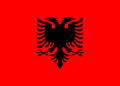 |
 Good Good |
The emblem is a bit too intricate, but overall, nice design with good colors. Black is kind of hard to see on top of red, though.
|
| Algeria |
 |
Good |
Good, but the red on green is a bit hard to see.
|
| Andorra |
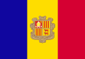 |
22% |
|
| Angola |
 |
88% |
|
| Antigua and Barbuda |
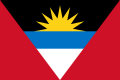 |
52% |
|
| Argentina |
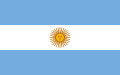 |
Good |
The sun creeps me out, but unique design and nice colors.
|
| Armenia |
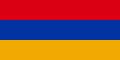 |
12% |
|
| Australia |
 |
Good |
Simplistic stars make it work.
|
| Austria |
 |
86% |
|
| Azerbaijan |
 |
88% |
|
| Bahamas |
 |
44% |
|
| Bahrain |
 |
93% |
|
| Bangladesh |
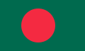 |
 Bad Bad |
The red and green together are ugly colors.
|
| Barbados |
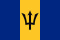 |
Good |
Ugly colors, but simple and nice design.
|
| Belarus |
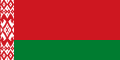 |
Bad |
Bad, but not that bad. It looks like a bed's blanket. The design looks like blood spattered on a bathroom wall.
|
| Belgium |
 |
Bad |
Ugly proportions, makes it look obtuse and contorted.
|
| Belize |
 |
Bad |
Horrible. Looks like a restaurant table place-mat from some casual dining eatery.
|
| Benin |
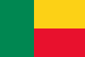 |
27% |
|
| Bhutan |
 |
79% |
|
| Bolivia |
 |
59% |
|
| Bosnia and Herzegovina |
 |
48% |
|
| Botswana |
 |
94% |
|
| Brazil |
 |
Good |
Although there is writing and way too many stars, the nice color choices and unique lozenge design make up for it.
|
| Brunei |
 |
32% |
|
| Bulgaria |
 |
93% |
|
| Burkina Faso |
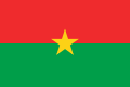 |
11% |
|
| Burundi |
 |
Bad |
Looks like the targeting reticule from an 8-bit video game.
|
| Cambodia |
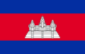 |
69% |
|
| Cameroon |
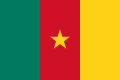 |
79% |
|
| Canada |
 |
Neutral |
Shade of red is far too bright; hurts my eyes.
|
| Cape Verde |
.svg/120px-Flag_of_Cape_Verde_(3-2).svg.png) |
87% |
|
| Central African Republic |
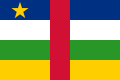 |
10% |
|
| Chad |
 |
76% |
|
| Chile |
 |
81% |
|
| China, People's Republic of |
 |
Good |
Simple design, nice colors. Unlike Taiwan and Canada, the shade of red is just right.
|
| China, Republic of |
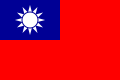 |
Good |
Good design, but those colors are too bright! Ouch!
|
| Colombia |
 |
78% |
|
| Comoros |
 |
60% |
|
| Congo, Democratic Republic of |
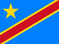 |
85% |
|
| Congo, Republic of |
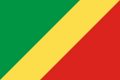 |
Good |
Great colors and simple design, very vibrant! Good flag.
|
| Costa Rica |
 |
50% |
|
| Cote d'Ivoire |
 |
64% |
|
| Croatia |
 |
14% |
|
| Cuba |
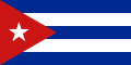 |
83% |
|
| Cyprus |
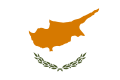 |
87% |
|
| Czech Republic |
 |
Good |
Clichéd colors, but good and simple design.
|
| Denmark |
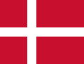 |
73% |
|
| Djibouti |
 |
65% |
|
| Dominica |
 |
27% |
|
| Dominican Republic |
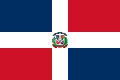 |
85% |
|
| East Timor |
 |
Good |
Nice color choices, simple design.
|
| Ecuador |
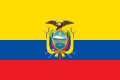 |
59% |
|
| Egypt |
 |
89% |
|
| El Salvador |
 |
20% |
|
| Equatorial Guinea |
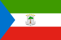 |
5% |
|
| Eritrea |
 |
10% |
|
| Estonia |
 |
73% |
|
| Ethiopia |
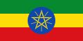 |
Good |
I like the vibrant colors and nice pentagram design.
|
| Fiji |
 |
Bad |
What is this? I don't even.
|
| Finland |
 |
86% |
The cross is slightly too thick but otherwise this is the best Nordic Cross national flag.
|
| France |
 |
67% |
|
| Gabon |
 |
85% |
|
| Gambia, The |
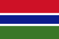 |
Good |
Good color choices and design, which represents the country's geography. Arguably the world's best-designed flag.
|
| Georgia |
 |
Good |
Simple, yet distinctive. Good colors.
|
| Germany |
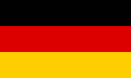 |
70% |
|
| Ghana |
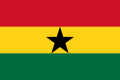 |
Good |
I like, but that black star needs some breathing room.
|
| Greece |
 |
Good |
Un-original, but good colors and design.
|
| Grenada |
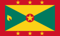 |
Bad |
Looks like an NBA regulation hardwood court.
|
| Guatemala |
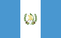 |
47% |
|
| Guinea |
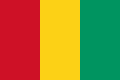 |
78% |
|
| Guinea-Bissau |
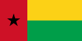 |
20% |
|
| Guyana |
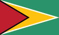 |
Good |
Simple design, and nice vibrant colors. This flag was designed by a vexilologist, and it shows.
|
| Haiti |
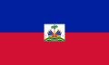 |
Bad |
Looks like somebody took a JPEG image of the country's seal and slapped it onto two contrasting rectangles in Microsoft Paint.
|
| Honduras |
.svg/120px-Flag_of_Honduras_(2022–2026).svg.png) |
50% |
|
| Hungary |
 |
67% |
|
| Iceland |
 |
77% |
|
| India |
 |
96% |
|
| Indonesia |
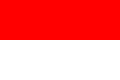 |
74% |
|
| Iran |
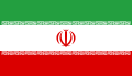 |
Bad |
The Takbirs look like Tetris puzzle pieces and the seal looks like a penguin with a handlebar moustache or mammary intercourse.
|
| Iraq |
 |
Good |
Now, vexillologists frown upon text usage on flags, but Arabic script works better than Latinate characters.
|
| Ireland |
 |
Good |
Nice colors, but very bad proportions.
|
| Israel |
 |
Good |
Good, but give that star a little breathing room!
|
| Italy |
 |
88% |
|
| Jamaica |
 |
Good |
Great colors and simple design. One of my favorite flag designs.
|
| Japan |
 |
97% |
|
| Jordan |
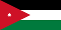 |
Neutral |
Nice design and colors, but the star is too small.
|
| Kazakhstan |
 |
86% |
|
| Kenya |
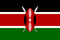 |
94% |
|
| Kiribati |
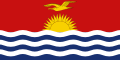 |
62% |
|
| Korea, North |
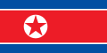 |
85% |
|
| Korea, South |
 |
Neutral |
The symbols are a bit hard to remember.
|
| Kosovo |
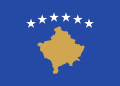 |
95% |
|
| Kuwait |
 |
Good |
Nice colors and design. Aspect ratio seems a bit long, though.
|
| Kyrgyzstan |
 |
66% |
|
| Laos |
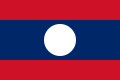 |
Good |
Nice colors and simple design.
|
| Latvia |
 |
94% |
|
| Lebanon |
 |
58% |
|
| Lesotho |
 |
76% |
|
| Liberia |
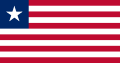 |
Good |
Un-original, but vexilologically speaking, it's a good flag.
|
| Libyan Arab Jamahiriya |
.svg/120px-Flag_of_Libya_(1977–2011).svg.png) |
Bad |
Did they even try?
|
| Liechtenstein |
 |
Bad |
Logo in the corner looks like a stiletto dagger being being stabbed in between some poor wretched woman's breasts.
|
| Lithuania |
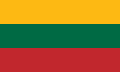 |
77% |
|
| Luxembourg |
 |
71% |
|
| Macedonia |
 |
76% |
|
| Madagascar |
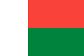 |
30% |
|
| Malawi |
 |
74% |
|
| Malaysia |
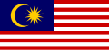 |
64% |
|
| Maldives |
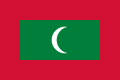 |
19% |
|
| Mali |
 |
46% |
|
| Malta |
 |
75% |
|
| Marshall Islands |
 |
64% |
Looks more like a logo than a flag.
|
| Mauritania |
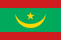 |
76% |
|
| Mauritius |
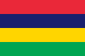 |
24% |
|
| Mexico |
 |
Good |
Usually I'm against slapping a seal on a flag, but it looks good here. The shades of red and green look nice.
|
| Micronesia, Federates States of |
 |
74% |
Too long.
|
| Moldova |
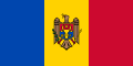 |
77% |
Too long.
|
| Monaco |
 |
71% |
|
| Mongolia |
 |
74% |
|
| Montenegro |
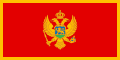 |
61% |
|
| Morocco |
 |
86% |
|
| Mozambique |
 |
76% |
|
| Myanmar, Union of |
.svg/120px-Flag_of_Myanmar_(1974–2010).svg.png) |
39% |
|
| Namibia |
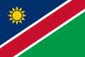 |
82% |
|
| Nauru |
 |
88% |
|
| Nepal |
 |
77% |
|
| Netherlands, The |
 |
81% |
|
| New Zealand |
 |
Neutral |
I like where they're going with the red stars, but the uninspired British flag slapped onto it detracts from the design.
|
| Nicaragua |
 |
77% |
|
| Niger |
 |
Neutral |
The design itself isn't bad, but the color choices are god-awful.
|
| Nigeria |
 |
Good |
Nice colors, good design, but bad proportions.
|
| Norway |
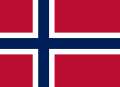 |
75% |
|
| Oman |
 |
47% |
|
| Pakistan |
 |
Good |
Nice and simple design, however, the shade of green is way too dark.
|
| Palau |
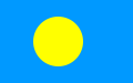 |
79% |
|
| Panama |
 |
Good |
Good color choices and nice design with the two stars.
|
| Papua New Guinea |
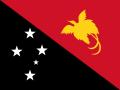 |
84% |
|
| Paraguay |
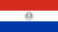 |
89% |
|
| Peru |
 |
Good |
Simple tri-color, with good, bold contrasting colors. Good flag.
|
| Philippines, the |
 |
80% |
|
| Poland |
 |
78% |
|
| Portugal |
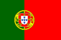 |
65% |
|
| Qatar |
 |
73% |
|
| Romania |
 |
74% |
|
| Russian Federation |
 |
Good |
Simple, yet good tricolor.
|
| Rwanda |
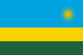 |
46% |
|
| Saint Kitts and Nevis |
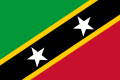 |
89% |
|
| Saint Lucia |
 |
15% |
|
| Saint Vincent and the Grenadines |
 |
76% |
|
| Samoa |
 |
61% |
|
| San Marino |
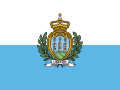 |
Bad |
Looks like a diaper.
|
| Sao Tome and Principe |
 |
72% |
|
| Saudi Arabia |
 |
81% |
|
| Senegal |
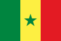 |
70% |
|
| Serbia |
 |
72% |
|
| Seychelles, The |
 |
83% |
|
| Sierra Leone |
 |
Good |
Nice inoffensive colors.
|
| Singapore |
 |
76% |
|
| Slovakia |
 |
Good |
That emblem looks evil, but evil in a cool way.
|
| Slovenia |
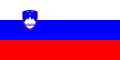 |
Bad |
Emblem is ugly.
|
| Solomon Islands, The |
 |
Good |
Good color choices. Yellow works well between blue and green. Nice arrangement of stars, not too many.
|
| Somalia |
 |
78% |
|
| South Africa |
 |
Good |
Very good design and choice of colors; in my top three favorite flags along with Gambia.
|
| Spain |
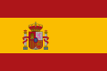 |
76% |
|
| Sri Lanka |
 |
Bad |
Looks like a beach towel.
|
| Sudan |
 |
67% |
|
| Suriname |
 |
Good |
Good, although the star's a bit too big.
|
| Swaziland |
 |
Bad |
Looks like a funeral pyre. Would look much better with the emblem removed.
|
| Sweden |
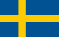 |
74% |
|
| Switzerland |
 |
Neutral |
Ugly proportions; square flags do not work very well. Also, the shade of red is way too bright. Could burn out people's corneas.
|
| Syrian Arab Republic |
%2C_Flag_of_Syria_(1980–2024).svg/120px-Flag_of_the_United_Arab_Republic_(1958–1971)%2C_Flag_of_Syria_(1980–2024).svg.png) |
Good |
Nice color choices, the green stars work well here. Very simple design.
|
| Tajikistan |
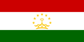 |
78% |
|
| Tanzania |
 |
79% |
|
| Thailand |
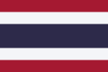 |
Good |
Good colors contrasts, simple design.
|
| Togo |
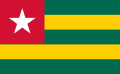 |
Good |
Lovely design and vibrant color choices. Very good flag!
|
| Tonga |
 |
78% |
|
| Trinidad and Tobago |
 |
80% |
|
| Tunisia |
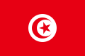 |
77% |
|
| Turkey |
 |
85% |
|
| Turkmenistan |
 |
Bad |
Looks like a bed's comforter.
|
| Tuvalu |
 |
9% |
|
| Uganda |
 |
76% |
|
| Ukraine |
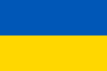 |
79% |
|
| United Arab Emirates, The |
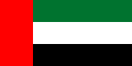 |
76% |
|
| United Kingdom |
.svg/120px-Flag_of_the_United_Kingdom_(3-5).svg.png) |
Good |
Very unique design, good symbolism, representing the constituent states.
|
| United States of America |
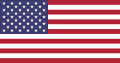 |
Good |
Good design, but the huge amount of stars is insane. What happens if there are 100 states in the union? They should've just stuck with the 13-star "Betsy Ross" flag from the 19th century and kept that as the permanent flag.
|
| Uruguay |
 |
77% |
|
| Uzbekistan |
 |
82% |
|
| Vanuatu |
 |
96% |
|
| Vatican City |
.svg/120px-Flag_of_Vatican_City_(2023–present).svg.png) |
Bad |
Looks like a napkin from a fancy hotel.
|
| Venezuela |
 |
Good |
Simple, yet distinctive.
|
| Vietnam |
 |
Good |
Simple design. Easy to remember.
|
| Yemen |
 |
Good |
I like the colors. Reminds me of Imperial Germany's flag.
|
| Zambia |
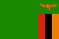 |
83% |
|
| Zimbabwe |
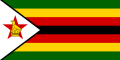 |
23% |
|


.jpg)


.jpg)
.jpg)
.jpg)
.jpg)
.jpg)


,_by_Joseph_E._Baker.png)
.jpg)
.jpg)
,_by_Thomas_Nast.jpg)


.svg)

,_by_Thomas_Nast.jpg)


,_by_Thomas_Nast.png)


.jpg)


,_by_Siegel,_Cooper_%26_Co.png)


.jpg)


.jpg)


,_by_Charles_Gustrine.jpg)
,_by_E.G._Renesch_of_Chicago.jpg)
,_by_E.G._Renesch.png)
,_by_E.G._Renesch.jpg)
,_by_E.G._Renesch.png)


.jpg)
,_by_Allyn_Cox.png)

,_by_Donna_J._Neary.jpg)
,_by_Donna_J._Neary.jpg)
,_by_Donna_J._Neary.jpg)
,_by_Donna_J._Neary.jpg)
,_by_Donna_J._Neary.jpg)
,_by_Donna_J._Neary.jpg)
,_by_Donna_J._Neary.jpg)
,_by_Donna_J._Neary.jpg)
,_by_Donna_J._Neary.jpg)
,_by_Donna_J._Neary.png)
,_by_Donna_J._Neary.jpg)
,_by_Donna_J._Neary.png)

,_by_Donna_J._Neary.png)

,_by_John_M._Carrillo.png)


,_by_Cory_Mendenhall.jpg)
,_by_Cory_Mendenhall.jpg)
,_by_Cory_Mendenhall.jpg)

,_by_Willie_Kendrick.jpg)


.svg)


.png)
.svg)
.svg)

.svg)
.svg)


.svg)
.svg)
.svg)
.svg)
.svg)
.svg)
.svg)
.svg)
.svg)
.svg)
.svg)


.svg)

.svg)
.svg)


_(1960–1963).svg)


.svg)
_(1963–1966).svg)


.svg)

.svg)


.svg)
.svg)


.svg)


.svg)
.svg)


.svg)


.svg)
.svg)

.svg)
.svg)
.svg)

.svg)
.svg)
.svg)


.svg)


.svg)
.svg)


.svg)


.svg)


.svg)
.svg)
.svg)
.svg)
.svg)
.svg)
.svg)
.png)
.svg)


.svg)


.svg)


.svg)


.svg)

.svg)
.svg)


;_Flag_of_the_African_Union_(2004–2010).svg)


.svg)
.svg)


.svg)


.svg)
.svg)
_with_Arms_(2020).svg)
.svg)

.svg)

.svg)
.svg)
.svg)
.svg)


.svg)
.svg)
.svg)

.svg)

.svg)


.png)


.svg)
.svg)
.svg)


.svg)


.svg)


.svg)

.svg)
.svg)

.svg)
.svg)

.svg)

.svg)
.svg)
.svg)


.svg)


.svg)
.svg)
.svg)


.svg)
.svg)
.svg)

.png)
.svg)
.svg)
.svg)

.svg)


.svg)
.svg)

.svg)

.svg)
.svg)


.svg)


.svg)
_crowned.svg)


;_Flag_of_Kazakhstan_(1991–1992).svg)


.svg)


.svg)
.svg)

.svg)

.svg)


.svg)

.svg)


.svg)

.svg)


.svg)
.svg)
.svg)


.svg)
.svg)


;_Flag_of_North_Macedonia_(1991-1992).svg)


.svg)
.svg)
.svg)
.svg)

,_Flag_of_Serbia_(1947–1992).svg)

.svg)
.svg)

.svg)
.svg)


.svg)

.svg)
.svg)
.svg)
.svg)


.svg)

.svg)


.svg)
.svg)
.svg)


.svg)
.svg)
.svg)
.svg)
.svg)

.svg)


.svg)


.svg)


,_Flag_of_Syria_(1980–2024).svg)


.svg)


.png)
